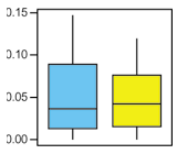
If you are suffering some type of color vision deficiency you definitely know those situations: You try to read a beautifully colored chart, whereas the biggest challenge turns out to be matching the legend to the appropriate part inside the chart itself.
All the different type of charts usually have one thing in common, they have a color coded legend. This looks very nice and helps to differentiate between the labels and the information you want to highlight. But this doesn’t take into account, that colorblind people might have great difficulties to match the correct labels to their counterparts or even tell the different segments apart from each other.

Just recently the guys from evolgen asked A Question for the Colorblind, where they try to find good colors for some informative charts. The solutions vary between using only shades of gray and random color suggestions from non-colorblind people. I don’t think this is the right answer to the question on how to color a chart taking into account also colorblind readers.
Scott from Standardzilla tries to go a more elaborate way. He is looking for good color combinations and analyzes the color contrast as well as the simulations of different color vision deficiencies. Introducing his thoughs with Color Blindness and Graphs and analyzing it at Colour Contrast Chart for Colour Blindness.
I propose we even have to go one step further. Here is my recipe on how to color charts respecting color blindness in three steps:
- Start with the theory of color blindness. The confusion lines are a great resource to discover colors that are and aren’t distinguishable by all three types of color vision deficiency.
- After you have chosen some colors which are not on the confusion lines of neither protan nor deutan nor tritan defects, enhance the color contrast as much as possible, while adjusting the brightness of each color.
- Check the adjusted color combination with one of the many available color blindness simulation tools. If the simulated colors look to close to each other, start all over again.
This three simple steps are not as easy to follow as it sounds. I suppose it will consume quite some time to really find the best colors for your colored chart while having in mind, that also colorblind readers should be able to catch your information easily without spending to much time on color legend deciphering.
There are also some quicker ways to improve the readability of your charts:
- Patterns: Not only use colors but also patterns to mark your charts.
- Label Inside: If possible, label the charts inside themselves or…
- Label Outside: …attach each label to its segment (e.g. around a pie chart).
- 1 Color and Brightness: Use only one color and alter only its brightness.
- Grayscale: And of course, you can use just different shades of gray.
If you either try to find some good colors for your chart which suite everybody—even the colorblind people among us—or if you take a quick-win doesn’t really matter. Just bear in mind, if you offer a chart with a bad color choice, one out of ten males might have problems with its readability, which doesn’t really help to get your point across.

Great food for thought…
I would like to explore the ‘confusion lines’ you recommend a bit more to see how they impact the charts I am creating right now.
I dispute that most charts need to use colourblind-safe colours. You just have to be able to tell when one area begins and another ends. If there actually is a need, there is no cause to grope around with homemade or untested solutions; just use the Brewer palette from maps.
http://joeclark.org/book/sashay/serialization/Chapter09.html#p-1540
Joe: I suppose I don’t really understand your point. Because if I can’t tell apart one color from the other, it doesn’t help if I can see when one area begins or ends. I still won’t be able to fit the legend to the chart.
Thanks a lot for the link. I’ll need some more time to browse through your book and all the other interesting stuff you offer.
But I also had a look at the Brewer palette with ColorBrewer. I don’t agree that all those color palettes are best for usage respecting color blindness. For example five colors going from lighter to darker on a random map. I have great difficulties to match every entry to its corresponding legend point.